
After World War II, the United States went through the largest housing and commercial building boom in human history. Millions of soldiers came home, new modular construction methods appeared, and developers put up buildings faster than anyone ever had.
To keep up, builders borrowed the look of 1920s modernism (strict geometry, bare surfaces, clean planes, monochrome palettes) and left the thinking behind. Le Corbusier and the early modernists were deeply deliberate. You can see it in the structural purity of the Villa Savoye and in the founding principles of the Bauhaus. The post-war builders copied only the surface. Context, the needs of a particular site, and human proportion didn’t come along.

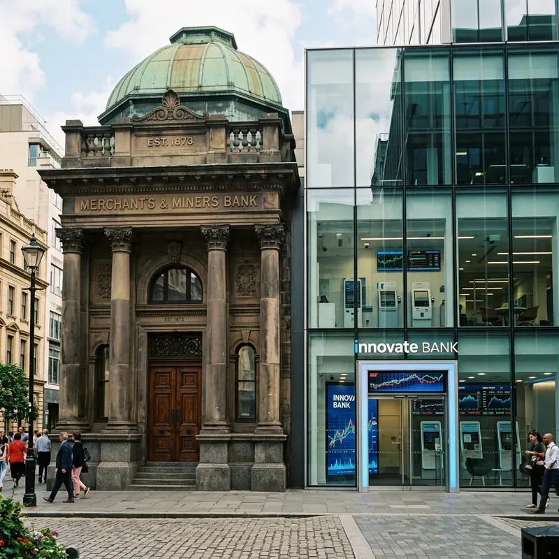
Over the following decades, the architecture of local communities wore down into generic boxes you could repeat anywhere. Banks show it best. A bank used to have a heavy stone facade, a grand entrance, and crafted masonry, all there on purpose to say that this place is safe and it will last. Those banks were replaced, one after another, by featureless cubes of glass and steel.
Software is going through the same thing. This time the catalyst is LLMs and code-generation tools, and an interface or a script appears the instant you type a prompt. Where the builders left context-blind “zombie buildings” and monotonous cities no one was clearly accountable for, teams now ship generic, unedited “zombie UI” that hides how little the software actually does. Brands blur together and context rots. Nobody means to keep any of it.
Whenever production capacity jumps without deliberate design leadership, you get work that looks alike and fits nowhere. Trust erodes soon after.
The burrito dilemma
Take a frozen burrito out of the freezer, hard as a rock, and microwave it for ninety seconds. You’ve gone from hungry to eating in a minute and a half. That’s so impressive that you overlook what you’re eating, which is unevenly heated and nearly inedible.

Generative AI does this to software. Type one prompt into an LLM and an interface appears almost instantly, with balanced drop shadows, subtle gradients, polished type, and rounded corners. It looks finished. So teams are tempted to ship it without asking the questions that matter. Does this flow solve the user’s real problem? Does it understand its context? Does it reflect our brand, or is it just pixels in plausible places?
When working software shows up in seconds, the speed hides whether it’s useful or distinctive, and leaders have to push against that on purpose. Teams that put speed ahead of intent end up with disposable software that nobody owns or maintains. It starts to look like the abandoned developments in Turkey: fields of identical, empty towers built with no thought for who would live there or what a community would need.

What prevents this is visible human care, anchored in a brand point of view that every automated workflow answers to and that isn’t up for negotiation. Grokbot’s expressive micro-animations show that care, and so do calendar icons that display the actual date. Small touches like these tell users a person was paying attention. The Link agent wallet goes further. It anticipates where complex automated purchases can fail and builds troubleshooting into the interface, even though the one using it may be an autonomous agent rather than a person.
Why the default is generic
LLMs are built to predict the most probable sequence of tokens given their training data. Ask one to design a layout or write product copy and you get the statistical consensus, whatever patterns were most common on the public web. A local Korean barbecue restaurant built its website from a default generative template, and it came out with exactly the layout, color hierarchy, button placement, and abstract hero images of a B2B SaaS landing page.

Rely on raw output like that and your product will look like everyone else’s, and your brand and your hold on customers will slowly wear away. So leaders have to hold what the models produce to an explicit product vision.
Quality doesn’t depend on the medium
In product reviews, someone often asks whether AI-generated work should get a more lenient bar, to keep things moving. The question misreads customers. Users care whether a product works and whether it delights them. Whether it came from an LLM in three seconds or a principal designer in three months never enters into it.
Which means that once AI makes building cheap, the competitive moat moves from how much you can build to how clear and rigorous your point of view is.
Building taste by noticing
When AI puts ordinary execution within everyone’s reach, taste is what’s left to tell good output from bad. It’s what decides which generated work gets kept, so it becomes a core business asset. And it can be trained. You build it by noticing, which means taking apart the things around you, digital and physical, to see why some earn trust while others feel disposable.
Watching users is one place to practice. Look past what they ask for, at the friction they never mention, how they react, and the workarounds they quietly invent. Your own day is another. Every product you use signals either care or indifference, and it’s worth keeping track of which is which. Other fields help too. Classical architecture, industrial design, fine art, and physical science all have structural, tactile, and aesthetic principles that carry over to interfaces.
Encoding standards into systems of intent
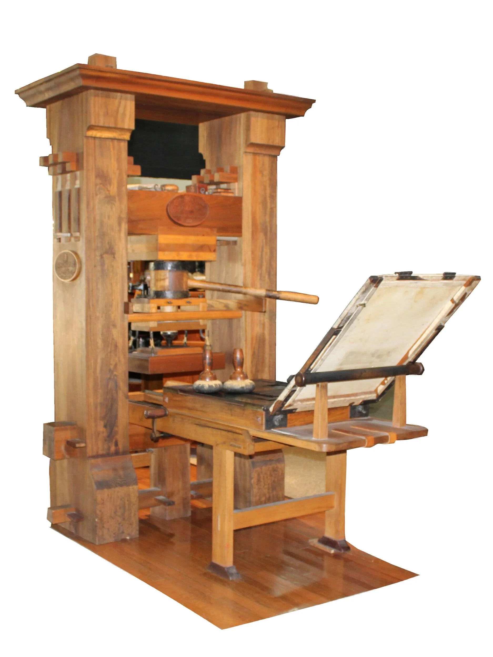
Gutenberg didn’t stop at 52 uppercase and lowercase letters. To match the elegance of hand-copied manuscripts, he made 290 distinct characters, including ligatures, abbreviations, and letters of varying widths. He needed them because justified text set with uniform letter blocks leaves irregular gaps between words, what typographers call “rivers and lakes of white space.” Those gaps hurt readability and weaken the page’s authority. With an opinionated, flexible system, a mechanical process could produce type as deliberate as a master scribe’s.
Design systems are at the same point now. The old ones kept human teams consistent, and they relied on designers in the room to interpret vague guidelines and make the trade-offs the rules didn’t cover. Autonomous agents, after-hours code patches, and interfaces generated in real time have nobody in the room. A design system written for people to interpret won’t guide them. It has to scale intent, which means going from a passive library of components to an opinionated harness that enforces brand rules at machine speed.
From component libraries to a CLI harness
Stripe’s first attempt used the Model Context Protocol (MCP) to feed static design docs into LLM prompts. Results varied wildly and context rotted badly. Three developers typing the same prompt got three completely different UIs. So the team built an opinionated command-line harness on top of the design system. It injects rules, constraints, and context into the AI tools at the moment of generation.
With the harness in place, the AI can only build with approved visual tokens, accessibility rules, and layout logic, so it can’t hallucinate inline styles of its own. Rather than isolated pieces like a lone button or input field, it sees complete end-to-end flow templates, which lets the model follow complicated sequences of behavior and state. And docs and brand rules arrive just in time, chosen for the specific feature being built, which eliminates context degradation over long sessions.
Even so, Christopher Alexander’s warning applies: “A system can satisfy every rule and still be dead.”
Confusing “done” with “good”
Engineering capacity used to be scarce, so a leadership team with twenty ideas had to argue nineteen of them down before anyone wrote code. Now a small team can build twenty working, interactive prototypes in a week. The theoretical debates go away, because you can judge live software. But the main quality filter moves to the end of the pipeline, and rejecting something already built takes far more discipline.
That makes the Editor a critical role. The analyst Nabil Qureshi observes that excellence in artistic composition comes from unexpected details, deep thematic continuity, and deliberate intent. Foundation models supply none of these on their own. Unedited “AI slop” offends people because it shows that nobody cared. A cup in an interface is green when it could just as easily have been blue, because no one decided. The Editor steps in, takes responsibility for every pixel and interaction, and refuses to accept “built” in place of “good.”
Unleashing artistry and “protecting the strange”

Floating chat widgets, standard analytics dashboards, simple prompt bars: AI interfaces have settled into a few predictable shapes, and treating them as the final form ignores how earlier shifts went. Real-time inference lets software parse natural language, interpret context, and generate an interface tailored to what the user needs at that moment. That’s a new substrate, the way multi-touch hardware made gestural interactions possible that a desktop couldn’t support, and the way the synthesizer made new genres of music.
The marbling method
The cover of Stripe’s publication Built to Grow wasn’t generated from prompts. A master marbler made the patterns by hand, on paper, which gave them organic texture and a fluid unpredictability. High-resolution scans went into custom generative models that tuned the color gradients, line density, and compositional geometry. Senior creative directors then made the final adjustments so the composition matched the book’s thesis.
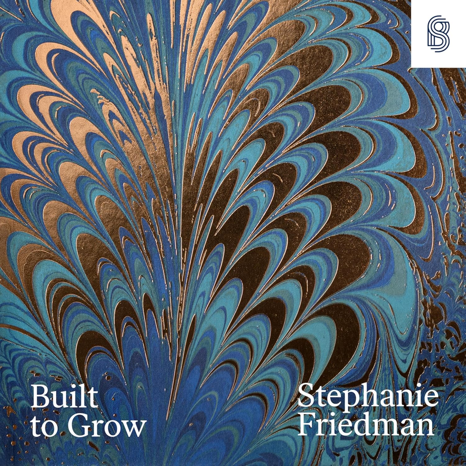
Any team can borrow the two things that made this work. It started from something no generic prompt could supply, so give your tools your own brand constraints, a written statement of your philosophy, physical source material, and your own visual references. And nobody trusted the first output. Reject first-pass generations by default, critique them hard, stress-test them visually more than once, and let adversarial review agents push the work past the usual templates.
Gothic architecture vs. digital monotony
In his 1850 critique of European industrialization, John Ruskin held up Gothic architecture as the height of human craft. No two pieces of a Gothic cathedral were identical, he observed. Every arch, capital, and carved stone showed its maker’s hand and care. Today’s zombie interfaces are the opposite, generated automatically with no sense of context and no human care.


AI cuts the cost of building software so far that leaders face a real choice. They can use it to make the old kinds of software faster, which lowers the quality floor. Or they can put what they save back into creative experiments, encourage teams to “protect the strange,” and push past comfortable templates.
The post-war builders took the first road, which is how the banks became glass boxes. This boom can still go the other way, into a lasting creative renaissance.
This article is inspired by the design philosophies of Katie Dill, Head of Design at Stripe, a company I really admire.